Loyalty
Overview Dashboard
Membership, points activity and reward performance at a glance.
The Overview is the health check for your loyalty programme.
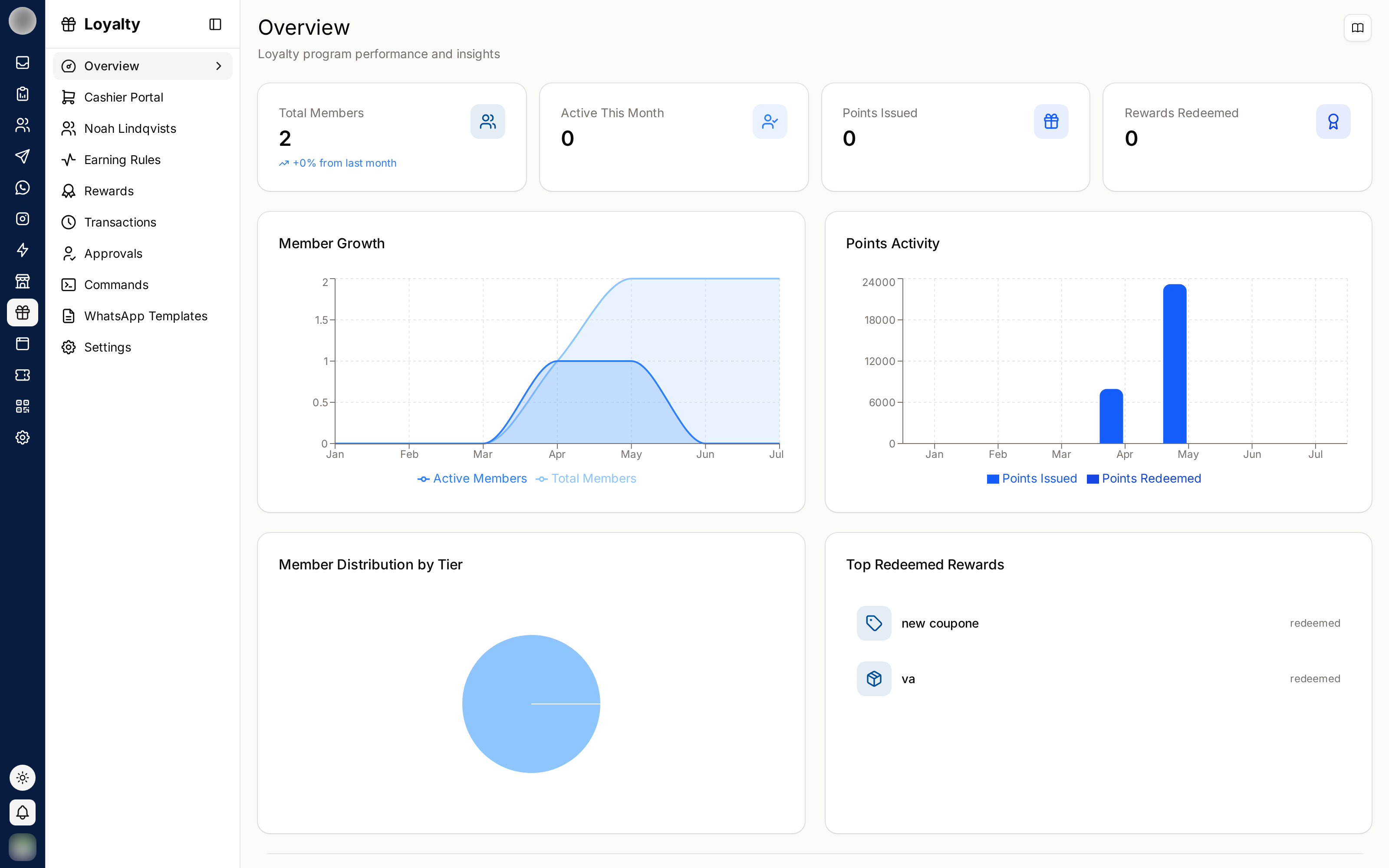
The Numbers
| Card | Meaning |
|---|---|
| Total Members | Everyone enrolled |
| Active Members | Members with recent activity |
| Active This Month | Members who did something this month |
| Points Issued | Points given out |
| Points Redeemed | Points spent on rewards |
| Rewards Redeemed | Number of redemptions |
Charts
| Chart | Shows |
|---|---|
| Member Growth | Enrolment over time |
| Member Distribution by Tier | How members are spread across your tiers |
| Points Activity | Points issued against points redeemed |
| Top Redeemed Rewards | Which rewards people actually want |
| Recent Activity | The latest events in the programme |
Reading It Properly
The single most important relationship is points issued vs points redeemed.
| Pattern | What it means | What to do |
|---|---|---|
| Issued far exceeds redeemed | Points are piling up unspent — the rewards are not attractive or not reachable | Lower a reward's cost, or add one people want |
| Redeemed close to issued | Healthy circulation | Nothing |
| Both low | Members are not engaging at all | Check notifications are reaching people |
| Members growing, activity flat | You are enrolling people who never return | Look at the first-week experience |
A large unredeemed point balance is a liability, not a success. Every one of those points is a promise you will eventually have to honour — and a customer who never redeems is a customer who stopped caring.
Tier Distribution
Most programmes should look like a pyramid: many members at the base tier, fewer at each step up.
If almost everyone sits in the base tier, your thresholds are too high to be motivating. If everyone reaches the top, they are too low to mean anything.